Showing posts with label logos. Show all posts

Sunday, June 3, 2012

FUBAR's 2012 Comic-Con Exclusive


Here's some thrilling and terrifying news: it's closing in on one month until the 2012 San Diego Comic-Con is upon us!  I've still got lots to do to prepare, but I'm making headway every day...it always seems like there's another dealing looming.  It's going to be a big show, of course, and I'm trying to be as prepared as I can be, even though experience tells me that there's no way to be 100% ready.

One of the things that Comic-Con is known for is exclusive products, and I felt like it would be cool to get in on that train.  Now that the dust has settled, I'm happy to announce that, with the help of some friends, I've put together an exclusive FUBAR book featuring an all new story titled "Old Ghosts".  I've shown a clip before; here's another:


The story is 11 pages long, is written by me and features art by Daniel Thollin.  The cover you see at the top of the page is by head honcho Jeff McComsey.  It's the first time we've used the FUBAR Presents logo and it may not be the last!  But if you wanna get a copy, it'll have to be in San Diego at Comic-Con.  We're printing out 200 copies of the 24-page book and selling it for $2.99 (well, $3.00, I guess).  It'll be interesting to see how the books do.  From an overall perspective, I hope that they get a few more people to check out the big anthology books.  The third anthology is coming along nicely and is on schedule for a late 2012 release.  I just saw the finished cover today!


I (almost desperately) wanted to use the official Comic-Con logo on the issue, and for a while, it seemed like it was going to happen.  Comic-Con lets others use its logo for no charge, and many items you see from the show have a sticker displaying the exclusivity and the famous Comic-Con eye that you see above.

When I submitted the book for review, though, I was told that FUBAR could not use the logo because the book was not all-ages appropriate.  Naturally, I already knew that, as it's got the same content on the surface as many other zombie-themed books: violence and gore.  What I didn't understand at the time is why FUBAR is excluded from using the logo when other "mature" items get the green light.

I brought this up with someone at the convention, and was told that no mature items are allowed to use the logo.  I knew that I had seen books that were just as, if not more, violent than FUBAR with the logo attached, so I did a quick Google search.  In no time I found the following two images among others of a similar nature:


Hey!  That's what we call a double standard, folks.  And I get it - life's not fair, and if you've got a big Hollywood presence, some of the rules are bent for you.  It's a shame and I wish we could use the logo (because it looks...so...cool!), but I guess it is what it is.  I don't want this post to come off like I've got a grudge or anything, because in the big scheme of things it's not a big deal.  But I was a little upset.  Even so, I look forward to hawking this limited edition of FUBAR Presents at Comic-Con!  Maybe I'll sell 199 and hold one back...for eBay.  That'd be something.

Saturday, April 14, 2012

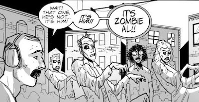
"Weird Al" Yankovic's "UHF" Six Panel Cinema


Back when the FUBAR 2 Kickstarter fundraiser was under way, I pledged much more than I had originally intended because one of the rewards was too enticing for me to pass up (I suppose that this is what makes some Kickstarter projects successful and others not).  The reward in question was a "Six Panel Cinema" page by none other than FUBAR head honcho Jeff McComsey.  The idea behind Six Panel Cinema is simple, yet brilliant - you take a movie and whittle it down to its six most important or memorable scenes.  Jeff has given a number of movies the six panel treatment, most of which can be seen here: http://sixpanelcinema.wordpress.com/

I jumped at the chance to choose one for myself, and it should come as no surprise that I chose "Weird Al" Yankovic's 1989 classic, UHF.  I'm a big fan of Al's and the movie is one of the highlights of his career.

After I paid up, I buckled down and watched the movie one more time, choosing the six scenes you see depicted in the image above.  It was tough going with only six - there are so many more important scenes (and I wanted to include a panel of the Money for Nothing/Beverly Hillbillies music video, but alas...).  Other than a cameo in the last panel, I completely cut out Victoria Jackson's character, and that's a shame.  But I did manage to work in most of the other main characters and, ultimately, I think that I chose the most important scenes.  I'm very happy with the way this turned out.

I told Jeff that I wanted to letter the page when it was finished, and he was gracious enough to turn it over to me for that purpose - I had to be involved with the creative process in some capacity.  I also took the opportunity to hand draw the UHF movie logo.  I'm no artist and what I ended up with isn't perfect, but it's my honest best and a tribute to just how much I like UHF and how much of a fan I am of Al and pretty much anything he does (check out his great new web series, "Face to Face"!).


I also colored a version, using the original movie poster colors:


In the end, we used colors that matched the theme of the rest of the page, which was the right choice.  Jeff and I also chose Lee-and-Kirby-style nicknames from the movie.  I went with "roooad maps!" and Jeff took "dog snot" - I was tempted to use the entire "festering bowl of dog snot" line, but perhaps simpler is better.

This is the second comic featuring Weird Al I've been involved in.  Last year I worked with Adrian "Bago" Gonzalez in creating "Accordion Theory", which I mention at every opportunity.  I can't help it.  Whatever.

Anyway, this Six Panel Cinema will find its way over to my webcomics section before too long, where it'll live forever in reverence.  I hope that you, faithful readers, enjoy this short comic.  And if Al finds this via a web search for himself...hi, buddy!


Monday, September 26, 2011

finally complete: the Andromeda Jones cover


Karin Rindevall dropped this in my e-mail today - it's the final version of the Andromeda Jones cover that has been a work years in progress, and it's truly an international collaboration.  Those who've worked on it have been from North America, Asia and Europe.  Pencils for this beauty are by Chris Whetzel, inks by Alan Gallo, colors by Karin Rindevall and the background image by Jason Moser.  I think it's one of the nicest pieces of art I've ever been involved with.  The final logo for the cover is below...all in all it'll look very nice in print.


Thursday, February 3, 2011

Teddy and the Yeti logo: a (kind of) step by step process

I was going through some files yesterday looking for a few old page layouts.  As sometimes happens during these searches, I find myself looking at things that have nothing to do with what I'm trying to find.  Such is the case with these logo concepts put together for Teddy and the Yeti a few years back.

These designs are all by the extremely talented Jimmy Vann, who also created the Andromeda Jones logo that I love so very very much.  I've since lost track of Jimmy - I wrote to him one day and it shot right back to me.  Jimmy, come back!!  But before disappearing mysteriously he put together these different logo possibilities that you see below.  The directions I gave mentioned that I wanted the "Teddy" part to be neat and organized while the "Yeti" part should be wild and animalistic:


The first thing I had to do, obviously, was point out that "Yeti" only had one "t".  It should be apparent that I thought option D was the best, though "Teddy" seemed too cute for my liking, almost like it was a logo for some teddy bear-type toy.  Since Ted is a robot, I thought it'd be fitting to have his name look metallic, with rivets and the like.  Jimmy took my comments and came back with the following:


...which is pretty close to the final version.  I wasn't crazy about the claw marks and I wanted to see what the logo would look like if "Teddy" were in all caps, which led to this new sheet of options:


After seeing the results, all caps didn't really do it for me, so I went with #2 on the list.  Looking back on these files, I still think I made the right choice.  Jimmy was so helpful in putting this logo together and he freely came up with so many options out of his own sense of creativity.  The logo work he did is one of the first things people see when they come across the book and the characters, so it's really important in that regard.  I don't know what everyone else thinks of the logo, but I'm pretty sure I struck gold.