Showing posts with label Illustrator. Show all posts

Wednesday, May 25, 2011

"Weird Al" Yankovic now has a copy of "Accordion Theory", new FUBAR, Franks and Beans and more notes!


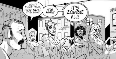
As I've mentioned a few times in the past couple weeks, the above "Accordion Theory" comic strip was created because of a new "Weird Al" Yankovic coffee table book that's set to come out in 2012.  There was a call for photos and artwork from fans, and since I don't have any uniquely good pictures and I can't draw a decent portrait to save my life, Adrian "Bago" Gonzalez and I put together the short strip you see at top.

The file has since been submitted to the publisher, which was one leg of the journey, but I also had an opportunity to see Al on tour this past Sunday at the new Stage AE in Pittsburgh, and I knew that I might be able to directly give the man himself a copy.

The show itself was unbelievable beyond the fact that Al and his band always put on a high energy, fun performance.  I managed to situate myself in the absolute front, pressed up against the stage, and - get this - I got to sing into the microphone twice during the show.  It was a really incredible experience all around and it's something I'll remember for a long, long time.

After the show was over, I had a chance to talk with Jon "Bermuda" Schwartz, Al's drummer and all around good guy.  I've met Jon a couple of times after shows, and he's always very friendly and willing to chat.  I'm also pretty convinced that the submission e-mail address goes directly to him, as he does a lot of archival work of Al's career and has a big online presence, so I managed to hand him a print of the comic along with the high resolution file on CD.

A handful - maybe 30 or 40 - of fans stuck around after the show long enough to say a few words to Al (it was nice of him to take the time after probably exhausing himself on stage for 2 1/2 hours), and I was able to ask him really fanboy-ish questions like "Why was the single version of 'UHF' put on your Essentials album instead of the longer version?" and "Is Victoria Jackson really crazy, or it is all an Andy Kaufman-like stunt?", and perhaps more importatnly, I was able to get him a copy of "Accordion Theory".  I have no idea if he's read it.  But man oh man, he got a print.  He even signed one for me, which you can see above.

This is the best picture I could manage to get while Al was signing stuff.  From our expressions below it looks like I'm giving him a speeding ticket or something.


And here's just a random picture from the show.  That "Fat" costume is great...but I'll bet it's pretty disgusting inside at the end of a touring season.  That's guitarist Jim "Kimo" West at the bottom left.  Fingers crossed for the coffee table book.


I knew it was a good sign when, the day after I posted the comic strip up for the first time, I checked the statistics on it and 27 people had viewed it overnight.  The number 27 is one that gets referenced a lot in Al's songs.  Oh, and after the show was over, I stopped at the casino next door and won exactly 27 dollars, no kidding.


A few more notes before I go:

- My good friend Paul Tucker and I are working on a new short story about a dead guy who solves murder cases.  Okay, that's an oversimplification, but Paul has really run with the concept and has taken it to greater heights than if I were the only one in chage.  The below panel is just some test art from Paul - it doesn't actually appear in the story, but it's gotten me to change a few things and incorporate some of the concepts of the panel itself.

Paul has been working on refining his craft for a number of months now, and the results should be obvious.  He's really got that old-time EC Comics look down.


- I'm beginning some work on a new FUBAR project; I won't give it away just yet (because I really am just getting started), but it involves the below comic strips and, well, zombie, of course.  It'll be different and, hopefully, exciting.  The Baltimore Comic-Con should be bunches of fun when it rolls around this August.


- Lastly, I took one of the Motor City Comic Con pictures into Illustrator and made a mock postcard for Franks and Beans.  Since we all love Franks and Beans (WE ALL DO), I thought I'd post it here as well.  That guy in the top right corner still makes it all work.

Friday, April 29, 2011

Jim Campbell's lettering guide


As much as I rely on Comicraft's Comic Book Lettering guide as a manual on, well, comic book lettering, there's still some things that the book doesn't show, and thus, some things that drive me absolutely crazy.  One of those is the "radio" balloon, used sometimes when characters are heard talking from intercoms, phones, radios and the like.  I've managed to avoid making these balloons up until this point, but I'm working on lettering an Andromeda Jones story that needs to have them.  Here's what I'm talking about:


I've managed to find very few resources online that help with such tasks, so my friend Brant Fowler pointed me to a PDF file that should serve as a decent source for any would-be letterer.  It's A Guide to Comic Book Lettering with Adobe Illustrator by Jim Campbell, and you can download it here.

The guide goes over a number of common and not-so-common lettering techniques, some of which are different than what I use currently, some of which I've never had explained to me before.  Campbell's guide is made for Illustrator CS3; I use CS4, so there are some differences (Adobe recently came out with CS5, so the information is somewhat dated in some cases, though it's mostly still accurate).

In any case, this is a handy (and free) guide that I'd recommend that any comic letterer check out.  It's not a comprehensive guide and, as I said, there are some techniques that I do differently (mostly different ways to solve the same problems), but there are things that this guide points out that I've never read before, as because of that, it's a great resource to have around.  Check it out!


Here's a direct link: https://files.me.com/jim.campbell/qqt5ck.

Monday, February 15, 2010

Tools of the (lettering) trade

Lettering is one of those aspects of comic book production that people only notice if something is wrong with it.  The average reader doesn't pay a lot of attention to it - but it's crucial nonetheless.  I'm currently in the middle of lettering one of the short stories that'll appear in Teddy and the Yeti #3, and while trying to figure out what kind of speech balloon would work for the particularly hideous monster appearing within, I went to my handy source on all things lettering, Richard Starking's Comic Book Lettering: The Comicraft Way.

If I had to judge my lettering skills, I would say that they are adequate - serviceable but not advanced or flashy.  I decided to letter Teddy and the Yeti for two reasons: one, because it's my book and I can do as I please, thank you very much, and two, because it's cheaper in the long run (though buying Adobe Illustrator CS4 and several fonts isn't for the faint of heart).  Comicraft's guide to lettering is an indispensable tool in this regard, and any "trick" I'm able to pull off is a result of this simple-to-follow 64-page book.  I highly, highly recommend it to anyone looking to take on the unappreciated art form of comic book lettering.

Teddy and the Yeti #3 (one story within it, anyway) features the nightmarish villain "Craxl" (don't ask where I got the name from), and it was obvious that a regular speech balloon wouldn't do.  One of the pitfalls of lettering is trying to come up with a fancy new font and balloon for each new character - I'm of the mindset that less is generally more - but I figured that Craxl merited the distinction.  If you don't overuse it, it can be effective.

The result can be seen on the picture to the right, and I think it works without causing a distraction.  If anyone is interested, to create the balloon I made a simple ellipse shape, then converted it to guides.  I used the pen tool to create the jagged edge, connecting the lines when finished.  Some might prefer the edge to be uniform in its divots, but I think the random quality is an asset in this case.

The font I'm using is "killcrazy BB" from Nate Piekos's Blambot site - Blambot is another great resource for letterers, as the site gives away free fonts by the bucketload.  The pay fonts are well worth the price, too - Teddy and the Yeti's main font is called "silverage BB" and it has paid for itself time and again.

The lettering process takes up so much time in the overall scheme of putting an issue together - if I was more skilled at it, it would go more quickly, to be sure - but it's something that I find myself enjoying, especially when I can look at the final product and be satisfied with the result.

Friday, January 30, 2009

My favorite panel

We're seeing more progress made with our illustrious Teddy and the Yeti.  Colors are nearly done and letters (which I'm learning a great deal about) are coming along, albeit a bit slowly.

Along the way, certain aspects of the process stick out, but perhaps none more than the panel you see on the right.  This panel has fast become my favorite of the book.  Why?  I don't know, truthfully.  I guess I think that the expression sums up the Yeti pretty well, the colors are spot on, and...I just like it.  I don't have to explain myself to you!!!  Or, maybe, I do.  But that's the best I can come up with right now.

When I need inspiration for a script or the motivation to open Illustrator and letter some more, I look at the panel, and all seems right.

Strange, yes, but true.

Thursday, December 11, 2008

Speech Balloons

Progress on Teddy and the Yeti continues to be made.  Colored pages for the first issue are starting to roll in, leaving letters as the last piece of the puzzle to be...well, whatever you do with puzzle pieces.  What I'm getting at is this: we're nearing the end.

My good friends Brant Fowler and Adnan Virk are each contributing to the book in their own way with letters and advice, but I'm looking to take the bulk of the work on myself.  This entails that I actually learn how to letter, which is no easy task, but I'm working on it.  If nothing else, I spent a big hunk o' money on buying Adobe's Illustrator CS4 program, which is as daunting as it is wonderful.  This is obviously time consuming, but I think that in the end, as long as I can get the hang of it, it'll be worth it.  If I find out that I'm just not up to snuff, I'll take myself off of lettering duties - I don't want the product to suffer because of stupidity on my part - and hand those responsibilities off to someone else, but at least for now, it looks like I'll be adding that to my list of things to do.