Over the summer, I read through Kirk Demarais's "Mail-Order Mysteries" book, in which he compares the presentation of items in old comic book ads with the actual, physical products. It's a really fun book for those, like me, who hold a special, nostalgic place for those weird advertisements. Some of them even featured the Thing:

But as the world of print has changed, ads in comics seem to be fewer and fewer, with many ads from outside companies being replaced with in-house ads. I don't know why it should matter to me, because ads are generally distracting and comic companies aren't suddenly going to lower the cost on books just because they sell a few more ads, but because of the nostalgia factor, I find myself wondering where all the comic book ads have gone in the last, say, 20 years.

Both Marvel and DC are spending some shelf space on "facsimile"-style reprints, which reprint an old book to look almost exactly like the original, with the old advertisements and all. Marvel's one-dollar "True Believers" line also reprints books, but without the ads. It's hard for me to fathom why anyone would pay four bucks for a reprint when both companies are now reprinting tons of old issues for a quarter of the price, and yet I've found myself purchasing a few - the first of these, I believe, was last year's Fantastic Four #1 facsimile edition.
Do the ads and a slightly better paper stock make up for the three dollar difference? Almost certainly not...but they do give me the opportunity to compare the number and format of ads in the past with those of books today. And I'm going to share it with the Internet! Which is to say, I'm talking with myself and that's okay.
DC recently published a full reprint of Crisis on Infinite Earths #8 from 1985, the supposed death of the Flash. Here's what we find:

On the inside cover, there's an in-house ad about DC's 50th anniversary.

Later, there's an interactive Oreo ad.

This is followed by an ad for Reese's Pieces. It's (slightly) interesting to note that while the story pages look like they were printed from the original files, the ads appear to be scanned from a published copy, meaning they're not quite as crisp as the story pages. I guess there's no reason that DC would have kept stat copies of the ads from outside companies.
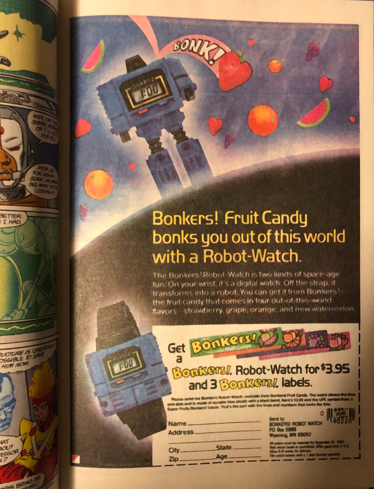
Next, we have an offer for a robot watch that, okay, still looks pretty cool, from Bonkers candy.

The next one is two half-page ads, one for the Transformers on VHS, the other an in-house ad for the New Teen Titans.

The next one has a familiar layout - I feel like I've seen any number of things sold with a similar mail-in form. This particular ad is for some glow-in-the-dark posters.

All right - now here's the classic comic book ad layout, with a ton of cheap gags and mailing lists to consider. I wonder if, at any point in the reprint process, anyone at DC considered replacing Red Cross ad with noted spokesman, uh, Bill Cosby.

Here's a subscription ad.

The inside back cover is similar to the inside front, as they both have editorial content.

And finally, on the back cover, there's a Kenner ad for the Super Powers toy line - a classic, for sure.
So let's add 'em all up. We have:
- 10 ad pages total, with 11 unique ads (or editorial content)
- 7 ads from outside companies
- 4 in-house-style ads or editorial pages
I'm counting the Super Powers ad as an outside ad, even though Kenner is selling toys based on characters owned by DC.
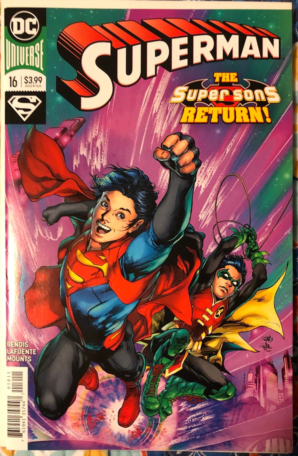
Now let's look at a recent book, Superman #16 from the current series.

On the inside front cover, there's an ad for the Adult Swim cartoon, "Primal". Now, Warner Bros. owns both DC and Adult Swim, so the parent company is the same. Did any money change hands to get this ad in this issue of Superman? Who knows! But I'm counting it as an outside ad, because I want to.

Next we have a superhero-themed Goldfish ad.

Here's an ad for a new wresting league. I've never been a fan of professional wresting. It was soap-opera-style storylines and big, muscular men who fight each other all the time with allegiances that seem to change week-to-week. Wait, that sounds exactly like superhero comic books. Uh oh.

Some people apparently hate these Snickers ads, because they're in a comic book style and sometimes you start reading them as if they were a continuation of the story in the book. Well, first, that's the point of formatting an ad like this, but also, how can you hate this an still pine for the old Hostess Fruit Pie ads? They're basically the same thing! I think they're great.

And then we have a long string of in-house ads, the first one of which is for the new Legion of Superheroes book.

And then one for the Zoom-line Black Canary graphic novel.

Here's one for the Doomsday Clock collection.

Here's one for the Heroes in Crisis collection.

And here's one for the DCeased collection.

At the back of the book, we have a "DC Nation" editorial page, followed by a DC Online video game ad. Again, it's tough to tell if this is an in-house ad or an outside ad, because I'm sure Warner Bros. has a lot to do with why this was placed in the comic.

Similarly, the back cover has an ad for a new Wonder Woman animated movie.
So, to the best of my understanding, here's what we have:
- 13 ad pages total, with 12 unique ads (or editorial content)
- 6 ads from outside companies
- 6 in-house-style ads or editorial pages
It looks pretty even when compared to 1985, even though many of the "outside" ads are from companies ultimately owned by Warner Bros.

Now, if I haven't lost everyone completely already, let's look at one from Marvel. This one is Howard the Duck #1 from 1976.

One the inside front cover, we've got an ad for...I've never read this ad in my life. Is it for model airplanes? Paper airplanes? Actual flight school for children? I'll never know.

One interesting thing about this book is that all of the non-cover ads were on two-page spreads, so none of them butted up against a story page. This spread has a bunch of ads, from a Slim Jim ad on the left to some in-house ads for the 1976 Marvel calendar and the "Son of Origins" book.

A lot of these pages are just jam-packed with ads. Who wants to be a locksmith? Who wants to customize a van? Who wants to...grow? Weird.

Another collage of ads on the left. Guitar lessons on the right! The Mail-Order Mystery book was born out of these pages.

Finally, an ad for Grit!

Half of all old comic book ads are for weight loss; the other for weight gain.

On the left we have our Bullpen Bulletins, and on the right - finally! - a Hostess Fruit Pie ad, with Spider-Man tossing pies to criminals! That'll teach 'em!

It's tough to tell if any of these are in-house ads or not. I'm going to say no, even though Spider-Man is featured prominently in both. Nothing like a little cross promotion!

On the back cover, we have a classic ad for Evel Knievel's Stunt Cycle!
This one is tough to quantify. Let's take a leap:
- 16 ad pages total, with 18 unique ads (or editorial content)
- 16 ads from outside companies
- 2 in-house-style ads or editorial pages
I'm counting those ad collages on a single page as one ad. Is that accurate? Uh...yes.

Lastly, here's a recent issue from Marvel, Avengers #24 from the current series.

On the inside front cover, we see the M&Ms cannibalizing one of their own. I think the recap page on the right counts as a story page, as opposed to something editorial.

This ad is for Marvel's online Contest of Champions game. Ugh, this really seems like an in-house ad, but I guess I counted DC's video game as an outside ad, so that's what I'll classify this one as, too.

This double-page spread is definitely in-house, celebrating the company's Eisner and Inkpot industry award winndes.
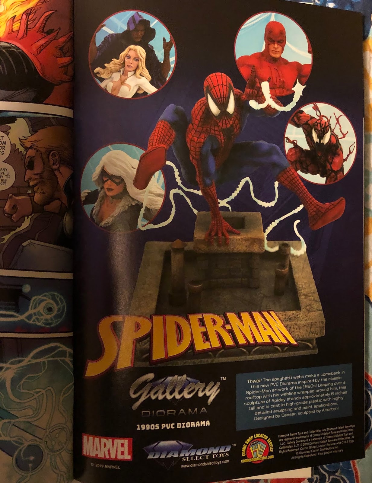
Next we have a Diamond Select ad for a Spider-Man diorama set.

On the left, we see the Cosmic Ghost Rider's skull, and on the right, we have a skull-themed ad for Venom Island. What can I say? Skulls are cool to draw.

Next we have an add for the new Mary Jane series, while at the bottom there's a code to download a digital copy of the book.

The "next issue" solicitation on the left, now that I think about it, should probably count as an editorial page. It's basically taken the spot of a letters page. And on the right, the inside back cover has an ad for Axe Body Spray.

And here's the back cover, with an ad for the Avengers: Endgame soundtrack.
That means we have:
- 10 ad pages total, with 10 unique ads (or editorial content)
- 5 ads from outside companies
- 5 in-house-style ads or editorial pages
Judging from just these two examples from 45 years apart, it seems that Marvel's ads have shrunk more dramatically than those from DC books - though I'd have to consider more issues than just two to come to any real conclusions. Still, it's interesting to see the shift in ad types over a few decades, especially considering the changes the print medium has gone through since these older books were printed.