Showing posts with label Howard Porter. Show all posts

Monday, November 7, 2016

New Fantastic Four original comic and cartoon art!

The past few weeks have been pretty good in terms of picking up some neat Fantastic Four items. I addition to some actual merchandise, I've acquired some original art from both the comic book and two of the cartoon series. And what good is a blog if not to show off your stuff? Here's some of that stuff:


Every year at the New York Comic Con, you can find a massive display of original art for sale near the entrance to artist alley. The art ranges from fairly cheap to sell-your-house expensive, and I tend to browse the lower end of the scale. But I've been able to find some deals on nice pieces over the last few conventions, and this year brought in two pages. The first is from Fantastic Four #505, where the FF invade Latveria to set up another epic Reed/Doom showdown. At the end of this storyline, the Thing literally goes to Heaven.


This page features some nice images of the Thing and the Human Torch as they break up some Doombots.


The art is by Howard Porter, with inks from Norm Rapmund. Porter was filling in for Mike Wieringo during his run with writer Mark Waid.


At some point in this story, Dr. Doom takes possession of the Thing's body and uses it to do what we'd all do in that situation, beat a lot of stuff up.


The ol' belt buckle communicator. I don't think the Thing needs the "4" symbol on his costume, but at least it was functional here.


The next page I grabbed (and paid for) is from the more recent Hickman/Eaglesham run, featuring the Council of Reeds, which included, you know, a whole lot of alternate reality Reed Richardses.


I'm a little surprised at how tight Dale Eaglesham's pencils are on this page. I'm not certain if he had an inker on the issues he drew or not.


This page has all four characters together, which is not always easy to find in original artwork. Here we see the Invisible Woman turning invisible for no apparent reason (but I appreciate the effort, Sue). Eaglesham tends to draw a bulky Thing with a smaller head. I'm just glad that we get to see all of those rocks and he doesn't cover them up with a giant costume. Draw 'im how Kirby intended!


This Reed Richards had the power to grow a huge beard (maybe).


My next group includes some production drawings from the 1967 and 1994 Fantastic Four cartoon!


I've been looking for artwork from the very early 1967 show for a while - it turns out that they've been on eBay under a different name (sneak eBay sellers). They had a number of production drawings, but I (of course) stuck with the Thing for now. It's such a weird design - different from really any other version of the character. It's very strange and pretty ugly. But I love it for those reasons.


Each of these three drawings came from the "MoleMan" episode. They're in great shape for being nearly 50 years old.


And I couldn't resist picking up another from the 1994 series as well.


Lastly, I finally managed to add a copy of Fantastic Four #50 to my collection, the final part of the Galactus trilogy. I've now got all three parts! This copy is in decent shape and looks nice next to issues 48 and 49.

That's it for now! I'll be sure to force you all to see more Fantastic Four items soon.

EDIT: This is my 700th post. You're welcome.

Thursday, February 4, 2016

New Fantastic Four original art (From FF #508, FF #538 and Marvel Adventures FF #7)


I picked up a few new pages of original art when I was at the New York Comic Con in October. There's always a big setup at the entrance to artist alley that has boxes and boxes of art from dozens of creators for sale, and it's easy to spend hours just pouring through the stacks and seeing what's available. Sometimes I'm taken back by the price tag attached to some of the pages - there are several pieces of newer artwork with asking prices in the four and even five-digit range. It serves as a reminder as to how serious some fans and collectors can get about comic art. I sometimes wonder who has the means to spend ten grand on a Avengers vs. X-Men page from a few years back, but I guess there's always someone.

For my own part, I tend to buy more affordable pieces. The most I've ever spent on a page is around $300, and even then I think I saw my house lights shutter and dim when I completed the transaction. I guess I went especially cheap this go-round, as I picked up some of the least expensive pages at the table, but I still walked away happy and with some neat original art from some recent Fantastic Four issues.


The first page comes from Fantastic Four #538. This was part of the uneven Straczynski/McKone run that was, honestly, sidetracked by the Civil War storyline too often. When Captain American and Iron Man are featured more prominently on the cover than members of the FF, something fishy is going on.

Anyway, the page I bought is obviously incomplete, with only two of eight panels drawn. This page was most likely one in which Mike McKone redrew the two panels to take the place of two earlier ones. I'm not sure if McKone went ahead and drew directly on this page or if inker Andy Lanning worked from McKone's reproduced pencils. I would usually guess that this is only Lanning's work, but there's no reproduced work on any of the other blank panels, so I'm not sure. I'm hoping for the best.


It should be apparent what drew me to this page: two panels of THE THING! For the price, it was well worth it. In this first panel, Ben is visiting Johnny in the hospital.


And then he makes a revelation, or something? I guess? This was around the time that the Thing left the country for France, which was such a strange decision. It was a weird time for the FF.


This second page comes from Fantastic Four #508, during the wonderful Waid/Wieringo run. Howard Porter filled in for 'Ringo on this storyline, so this page is by Porter with Norm Rapmund on inks.


This storyline ended with the Thing being *temporarily* killed. The FF soon after went to Heaven to bring him back (for real), so he's okay now.


This page was a good deal because, well, the Fantastic Four are nowhere to be found. They're in dire financial straits and they're in the process of shutting down the world-famous Baxter Building. This page is actually the final page of the issue and it has some tv-turning-off drama going for it. It's still a cool page even without the characters making an appearance. And the words "Baxter Building" do appear here, so I'm happy with it.


The last page I got is another "redraw" page, this one from Marvel Adventures Fantastic Four #7.


In this book, the Fantastic Four visit/fight Namor in his underwater domain.


The FF are seen here in one of Sue's force bubbles. It's pencilled by Manuel Garcia and inked by Scott Kolbish - I believe that the original line art that is on this page is by Kolbish...the signature at the bottom looks like his, anyway.

The page was originally supposed to be sold as part of a set with the complementary artwork, but I guess these got separated somehow. This means that I was able to pick up this partial page for only five bucks! That works for me.

The total amount I paid for these pages probably could have bought me one decent, complete page. That's probably what I'd do most days, but this time around I'm happy to add these snippets to my collection. I think they're pretty neat.
Friday, November 29, 2013

Autographs galore in the "DC Comics 60 Years" Hardcover


It's been a while since I've posted, but fear not!  Neither am I dead, nor do I no longer have anything to write!  Just the opposite, as it turns out...I've never had more going on with comics than I do right now.  At least I think so.  Whatever.  Anyway, let's turn our attentions to what, for all intents and purposes, serves as a precursor to the vaunted Thing sketchbook, an item from years past the I got during my formative years.  It's Les Daniels's DC Comics: Sixty Years of the World's Favorite Comic Book Heroes hardcover!  And what a treat it is.

I got this book soon after it arrived in bookstores in 1995, and it served as a source of inspiration for years.  In its covers, comic book historian Les Daniels briefly recalled the history of DC Comics, from its early 20th century beginnings to the arrival of Superman to Crisis and beyond.  Now that I look back on it, it's easy to see the book's flaws, but at 14 this was something that I just reveled in.

During my first few trips to the Pittsburgh Comicon in the mid-to-late '90s, I took this book with me and got signatures from anyone who had ever worked at DC Comics.  Looking back at this, it's easy to see how much the convention has changed.  In the 1990s, the Pittsburgh Comicon was home to a number of legendary Golden Age artists, many of whom I didn't recognize at the time but have since come to revere them for their contributions to the comic industry.  As I was just starting my comic collection and didn't have many books to get signed, this hardcover was a great alternative and, as you can see, it took on a life of its own after a while.

Let's look at the title page:


This is still pretty impressive to me some 15 years after I got my last signature into the book.  In fact, it makes me wonder why I stopped collecting autographs, as it became quite the eye-catcher.  But I guess I moved on to other things.  In any case, there are two things that stand out upon first glance of this spread: the DC Comics logo and the giant Hawkman image on the left side:


This image, drawn by Steve Lieber, was one of first - if not the actual first - entries into the book, probably from 1997 or '98.  If I'm remembering correctly, I saw Lieber draw a similar sketch for someone else, and I decided to press my luck.  The gamble obviously paid off.  Once I took the book around to other creators, they were of course confronted by this intimidating image, and many of them then decided to add their own sketches into the book.  Pretty lucky on my part.


Beau Smith is a writer who espoused his manliness in a tongue-in-cheek fashion in all of the comics he wrote.  Instead of drawing a comic character, he decided to draw himself, which is pretty awesome and manly.


Here's Dan Davis, an inker on, among other things, Stars and S*T*R*I*P*E.


Larry draws the Superman "S" in a number of places.  Roger Stern, writer on Action Comics for a good, solid run, does the same.


This classic Batman is by Dan Gotlieb.


Matt Wagner had a great Sandman run, and here is a great image of said character.


Stuart Immonen added this Superman bust.


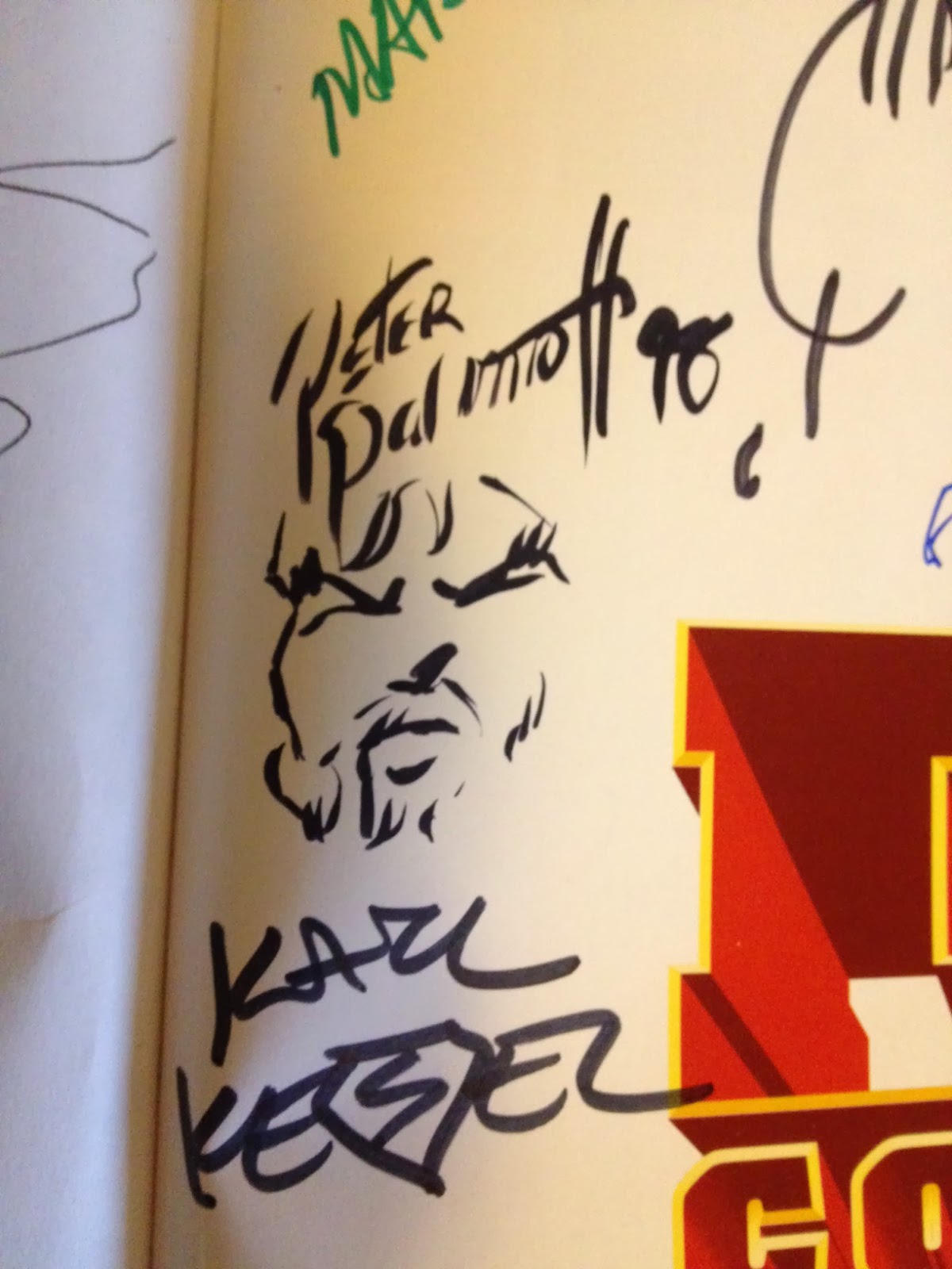
Peter Palmiotti drew this bearded Aquaman!


Pittsburgh Comicon stalwart Scott McDaniel drew the DC character he's most recognized for: Nightwing.


Darryl Banks was just starting out with his dollar sign signature in '99.  He's best known for co-creating the Kyle Rayner Green Lantern, and he added the symbol here.


Here's Howard Porter's Batman.  Porter had a great run on JLA with Grant Morrison.


Ron Frenz drew the electric Superman symbol.


Right smack in the middle of the title page are autographs from some legendary Golden and Silver Age creators who have since passed on.  I'm so glad that I got their signatures while I had the chance, and I wish that I had the wherewithal to realize just who was signing my book at the time...the follies of youth, I suppose.  Julius Schwartz, Shelly Moldoff, Irwin Hasen, Dick Ayers...all very important creators from the early days of comics.


The inside of the book featured brief articles on a number of topics.  At times, the book became more of a coffee table-style pictorial book as the pictures heavily outweighed the text.  But it was informative and interesting, especially to someone who really had little knowledge of comics before 1992.


Mart Nodell, co-creator of Green Lantern, was also a staple of the Pittsburgh Comic-Con in the 1990s.  I met him and his family a few times and came away with fun stories almost every time.


Here's a page on the Legion of Super-Heroes.  What stands out on this page?


Why, it's a Shrinking Violet sketch by W.C. Carani.  The picture doesn't do it justice - he meticulously inked this until it was perfect, and he did a great job of using negative space in the image.  It's hard to tell that the final product doesn't belong in printed book.


Once the front spread started to fill up, I started going to specific pages in the book to have creators signed.  Here's the second autograph from Julie Schwartz.


And, the greedy bastard that I am, I got another Steve Lieber Hawkman sketch.


Here's a fuzzy picture (sorry) of an autograph from Carmine Infantino, who just passed away a few years ago.


Once I figured that I couldn't possibly fit any more names or images in the front of the book, I moved to the back pages.  It wasn't quite the same and I eventually lost interest, I suppose.  The pages look a little sad and bare now that I look at them...perhaps I'll have to rectify that at some point.  Anyway, the back pages butted up against a recreation of the origin of Batman.  When artist Rags Morales saw where I was asking him to sign, he added in this funny disclaimer.


The back does have a quick Lobo sketch by Mark McKenna!


At some point, I decided to get a certificate of authenticity from the Pittsburgh Comic-Con.  I think they were three buck each at that point, so I guess I decided to get my money's worth as I had them load up on all of the signatures I had at the time.  As you can see, the person filling the certificate out struggled to list all of the names.

I took this book with me to a lot of different places at one time, but it mostly sits on a shelf these days.  Still, it's fun to take it out and look at it every once in a while, and it's astonishing to see some of the signatures I was able to get as a dumb kid who didn't know who he was talking to.