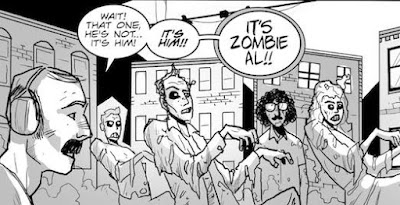
Lettering is one of those aspects of comic book production that people only notice if something is wrong with it. The average reader doesn't pay a lot of attention to it - but it's crucial nonetheless. I'm currently in the middle of lettering one of the short stories that'll appear in Teddy and the Yeti #3, and while trying to figure out what kind of speech balloon would work for the particularly hideous monster appearing within, I went to my handy source on all things lettering, Richard Starking's Comic Book Lettering: The Comicraft Way.
If I had to judge my lettering skills, I would say that they are adequate - serviceable but not advanced or flashy. I decided to letter Teddy and the Yeti for two reasons: one, because it's my book and I can do as I please, thank you very much, and two, because it's cheaper in the long run (though buying Adobe Illustrator CS4 and several fonts isn't for the faint of heart). Comicraft's guide to lettering is an indispensable tool in this regard, and any "trick" I'm able to pull off is a result of this simple-to-follow 64-page book. I highly, highly recommend it to anyone looking to take on the unappreciated art form of comic book lettering.
Teddy and the Yeti #3 (one story within it, anyway) features the nightmarish villain "Craxl" (don't ask where I got the name from), and it was obvious that a regular speech balloon wouldn't do. One of the pitfalls of lettering is trying to come up with a fancy new font and balloon for each new character - I'm of the mindset that less is generally more - but I figured that Craxl merited the distinction. If you don't overuse it, it can be effective.
The result can be seen on the picture to the right, and I think it works without causing a distraction. If anyone is interested, to create the balloon I made a simple ellipse shape, then converted it to guides. I used the pen tool to create the jagged edge, connecting the lines when finished. Some might prefer the edge to be uniform in its divots, but I think the random quality is an asset in this case.
The font I'm using is "killcrazy BB" from Nate Piekos's Blambot site - Blambot is another great resource for letterers, as the site gives away free fonts by the bucketload. The pay fonts are well worth the price, too - Teddy and the Yeti's main font is called "silverage BB" and it has paid for itself time and again.
The lettering process takes up so much time in the overall scheme of putting an issue together - if I was more skilled at it, it would go more quickly, to be sure - but it's something that I find myself enjoying, especially when I can look at the final product and be satisfied with the result.
Monday, February 15, 2010
Tools of the (lettering) trade
Labels:
Blambot,
Comicraft,
Illustrator,
lettering,
Teddy and the Yeti
Subscribe to:
Post Comments (Atom)


No comments:
Post a Comment