Saturday, December 31, 2022

"It's Cobblerin' Time" by Second Sin Brewing


My friend (and yours) Larry often tells me, "for someone who doesn't drink, you sure buy a lot of alcohol." Look, this is true. It's a contradiction to be sure. But Star Trek now makes a licensed Cardassian Kanar and Klingon Blood Wine! The Steelers have made commemorative beer cans for decades! There are several Weird Al-themed IPAs! And now, thanks to the Philadelphia-area Second Sin Brewing, there's a Thing-inspired sour ale named "It's Cobblerin' Time!" So I ask you this - what am I to do? NOT buy these collectable beverages? Nonsense.

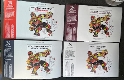
I found out about this new drink over the summer (back when I used to actually post to this long-neglected blog), and after a small amount of research, I discovered that the brewery where it is made and canned was not too far away. So I sent off an email to try to see where I might locate the final product and was told that...I'd have to go to the brewery itself. Second Sin is starting off small. But that was okay - I took the drive to just outside of Philadelphia, where not only was I able to purchase a Fantastic four-pack (I couldn't wait any longer to use that), but I was offered a tour of the brewery itself. Naturally, I took the owners up on it. I was greeted as "the Thing guy!", which is a title I am happy to wield.

I spent about a half hour hanging out in the back room brewery, watching the machines pour the beer and seal the cans, and I got to chat with some of the workers about comics and the Thing. I can hang around pretty much anywhere and talk comics, so this was naturally a great time for me. I got to learn a little more about the label's fruity-Thing artwork (a local artist drew it) and about the seasonal Cobblerin' offerings that the brewery cooks up throughout the year.

On the way out, the owners sent me off with the different, seasonal labels...

...and their last Cobblerin' Time glass! I'm really grateful for the time and effort that everyone at Second Sin shared with me on this hot summer day, chatting about the Thing and their new brew. I'm sure Ben Grimm would drink it daily, out of a dirty mug or something.

Thursday, June 30, 2022

"The Illustrated Al" from Z2 comics

All right, I know that I talk about "Weird Al" Yankovic on this blog a lot. You all know that I'm a big fan and as such, I have tried to make and pitch a few Weird Al comics in the past. I mean, there's one tagged at the top of the page here. You get the point. Anyway, it was only a matter of time until someone published a bonafide authorized Weird Al comic, and, through various steps of good fortune, I am going to be contributing to it. Wow!

The Illustrated Al will be published by Z2 Comics in the fall of 2022, and it's going to be produced by some dang comic book luminaries, such as Mike & Laura Allred, Bill Plympton, Peter Bagge, Ryan Dunlavey...and a few of my friends like Craig Rousseau and Kelly Phillips!


There will be a few different versions of the book, including a softcover, a hardcover slipcase, and a super deluxe version with a bunch of extra stuff included, like trading cards and a mini accordion! All of the versions are currently up for pre-order on Z2's website, which you can get to here!

All of the entries will be adaptations of some of Al's songs, hand-picked by the man himself. For my part, I'll be working on the song "Good Old Days," which is absolutely one of my favorite songs of all time. It's a James Taylor-sounding original and it goes to some dark places. Joining me on this story is my friend and frequent collaborator Jeff McComsey.

To say that I'm excited about this project is quite an understatement. In a lot of ways, I feel like this is the biggest project that I've ever been involved with, and I'm really excited to see it move forward. I can't wait to hold it in my hands. Can I share any artwork from my story yet? I don't know! Maybe? Heck, let's throw caution to the wind:


That'll have to suffice for now. I'll post about this again when the book comes out. If you'd like to hear me blab on about this further, I did an interview with Dave & Ethan's 2000" Weird Al Podcast, and you can get some more info there!

Monday, May 30, 2022

Introducing...the McClellafont!


I've spent the past few months trying to shore up some of my comic book lettering skills. I've lettered in some fashion for years at this point, but there are still things at which I'm not really proficient. This is partially because I'm lazy, but also because comic book lettering is, in many ways, Wild West-like in how people approach it. There aren't a lot of definitive resources out there, and a lot of what I've learned has simply been through trial and error. Nate Piekos did us all a great favor in publishing his The Essential Guide to Comic Book Lettering late last year, and I used that as a motivator to finally get some answers to questions that I've had for quite a while. If you're interested in lettering for comics, this book is a great resource!

One skill that I never really thought I'd acquire is creating a font from scratch, but I recently came across the video below from Joshua Smeaton, which shows how he created a font using his own handwriting: 


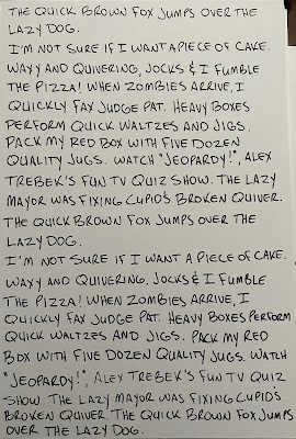
This was enough for me to start working on a font of my own, and pretty soon I was writing out panagrams - sentences that use every letter in the alphabet. Rather than using a digital tablet or an iPad, I hand-wrote all of the letters so they felt more natural. My handwriting is not what I would call artistic or even all that good, so I tried my best to make everything legible while still maintaining my own style. I used comic book backers for this, so now I have a stack of these bizarre ramblings in my house. If anyone would just stumble upon them...well, I guess I have weirder stuff lying around as well.


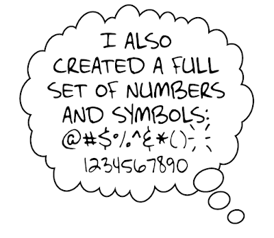
The whole process has been long and involved. I scan the letters into Adobe Illustrator, where the program traces them and makes them individual objects. After choosing what I feel are the best letters, I bring the letters into Fontself, an Illustrator extension, where the work gets even more meticulous. Not only am I looking to create a regular, all-caps font that I can use in comics, but the completist in me has put in motion a lowercase version, too, complete with alternate symbols for almost every character. In addition to this, there are bold, italic, and bold-italic versions that many good fonts need, plus symbols and other letters that are more common in Spanish and European countries that I'm trying to incorporate as well.


In all, this has been a ton of work, but the results are, so far, fun and at least somewhat encouraging. The above balloon looks okay, I think, though I'm continuing to tweak things that I think could be better. I figure that I'll be at this particular task for another month or two before I finally put it to rest. But at the end, I'll have a font that is completely my own and not subject to any licenses or agreements, and hopefully one that I find some uses for, too.

I've named this particular creation the McClellafont, which is a bit self-centered of me, of course, but it's mine and I'm owning it. I considered different variations of spelling like "McClellaphont," "McClell-O-font," "McClellephant," and other, worse options, but "McClellafont" is what we're going with for now.

While I'm waiting for the paint to dry on the McClellafont, I went ahead and made a much simpler font using a similar method, based on the keystrokes of my much-ballyhooed 1930s Underwood typewriter.


For this one, I typed up a bunch of text, scanned the letters, *painstakingly* adapted them in Photoshop, and then brought them into Illustrator, where Fontself took care of the spacing and kerning. Manual typewriters have fewer keys than a modern keyboard (mine does not have a key for the number 1; you use a capital I as a substitute), so this one had fewer characters to use.

This font, which I am unimaginatively calling "Underwood 1930s," features a regular and italic version with numbers and all of the symbols that are included on the actual typewriter. The one exception is the exclamation point. If you wanted to exclaim something using this machine, you needed to type a period and then draw in the top line with a pencil or pen. I felt that I couldn't be without one (I get excited sometimes), so I created one using two existing symbols, and the result is what you see above. I made a few tweaks before I was happy with the final version, as seen below:


I can hear the clickety-clack of the keys and the thunk-thunk of the carriage as I read the words! I'm not sure how often I'll use these fonts, but it was interesting to make them and I'm happy I did it. I have plans for maybe one or two more before my font-creating career comes to a close. But maybe you'll see one or both fonts in a published comic book before too long.

Friday, May 13, 2022

Thing sketchbook, part 25

It's the 25th installation of the (very popular) Thing sketchbook series! That means we've seen around 125 of these beauties so far. Let's see what these five look like, who they're from and where I got 'em!


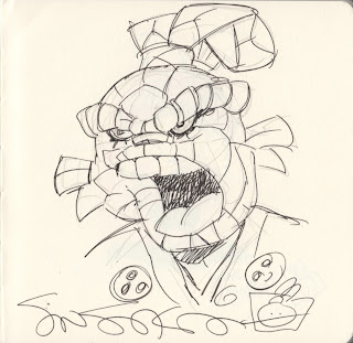
Stan Sakai - Comic-Con International 2019

Stan Sakai is a legendary artist who has spent the last few decades working on Usagi Yojimbo, which is an absolute masterpiece. I found him at his usual spot at Comic-Con in San Diego and thought I'd take a chance to see if he would draw the Thing in the ol' sketchbook. I handed him the book and paid the money, and then the negotiation began. At first he said he didn't want to draw the Thing, but thought about it for a minute and asked if he could draw his famous samurai rabbit as the Thing, and of course I agreed. This is one of the stranger entries into the sketchbook, but it's Stan Sakai, it's Thing-like, and I'll take it.


Julie Sakai - Comic-Con International 2019

Julie Sakai, artist on the Chibi Usagi feature and Stan's wife, was at the table with Stan while he drew his sketch. After he was done, we slid the book right over to her and she drew this lovely Usagi-as-the-Thing color illustration. It's like Usagi is dressing up as the Thing for Halloween, and I heartily approve.


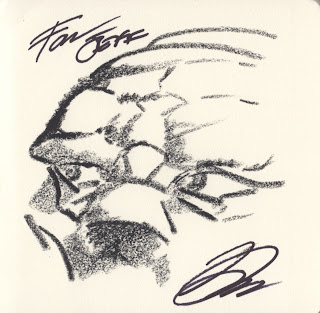
David Lloyd - Comic-Con International 2019

David Lloyd had a booth across from New England Comics' space at this show, so I kind of staked him out all weekend. Toward the end of the show, I found a time when he didn't have a crowd in front of his booth and I made my move. Lloyd, of course, is the artist on the classic V for Vendetta, and it was a pleasure to get to talk with him about comics while he sketched this rather spooky-looking Thing.


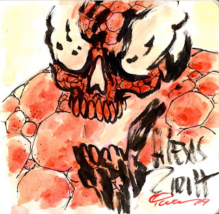
Alexis Ziritt and Ian Nichols - New York Comic Con 2019 and Rhode Island Comic Con 2019

Is this the Thing from Hell? If so, he's my favorite demon ever. Alexis Ziritt, who draws such wild stuff for books like Space Riders, started this sketch off with a flaming skull that is something of a trademark for him. My pal Ian Nichols finished it off by adding some colors and a wide frame for this Ghost Rider-esque Ben Grimm.

Okay, there are admittedly some very different Things in this entry. Let's wrap it up with a more traditional-looking Thing:


Art Baltazar - New York Comic Con 2019

Art Baltazar makes really wonderful kids comics like Tiny Titans and Aw Yeah Comics, and it's easy to see his broad appeal with this marker-and-crayon, very happy Thing sketch. Ben is so happy that it looks like he's beginning to unravel a bit! I saw Baltazar drawing sketches and I very tentatively approached him about joining the book - it's always a bit nerve wracking to barrel your way toward a booth with a book in hand - but he agreed to draw something and that's how we ended up with your good pal Ben here.

We're nearing the end of 2019 in the sketchbook - I hope nothing comes out of left field to really disrupt convention sketches in the near future. Er, I'll see you all next time!

Friday, April 29, 2022

The Thing is Marvel's best title! Here's some original art from Tom Reilly!

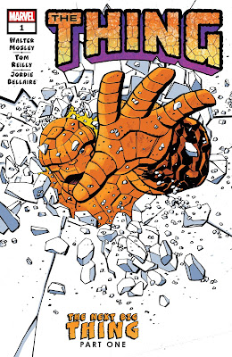
Let's take a minute to talk about how great Marvel's new Thing series is. The six-issue series, the character's first solo title since 2006, just wrapped up and I can't recommend picking this up highly enough.


Everything you love about the Thing is on display in this title. If you love the classic Thing - the good-hearted, brooding, never-say-die strongman, then you will love this book. If you love the more current interpretations of the Thing - the more polished, self-aware version, you will love this book! Walter Mosley, the best-selling crime novelist, seamlessly weaves new characters in with old favorites, adding to the title character's mythos while remaining true to his roots.

Artist Tom Reilly draws the Thing in a perfect blend of Kirby, Byrne and Wieringo. He makes him look tough without drawing him like a 12-foot, can't-fit-in-a-room monster. And he draws every page! All six issues are drawn by the same artist.

Does this series have team-ups? Yes! Does it have classic Fantastic Four characters? Yes! Does the Thing get all moody? Yes! Does the Thing punch a whole lot of people? YES! Let's look at some of the examples:


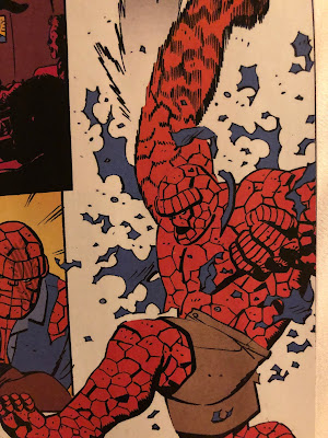
During one fight, the Thing punches a guy so hard his shirt blows up!


During another, he punches three villainous characters at once - including one with his head!

The Thing even manages to get his shots in at the Hulk! It really has a little bit of everything. You need to read this book!!

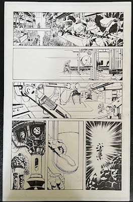
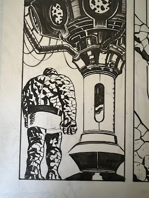
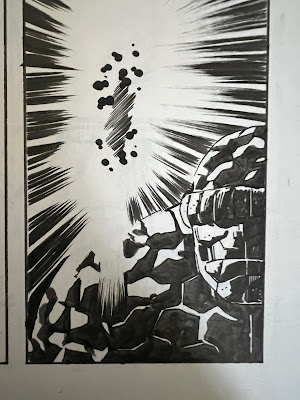
When Reilly announced that he would be selling some of his artwork from the series, I knew that I had to get a page. I ended up with two really amazing pieces from the series, and here they are for all to see!


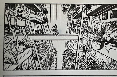
This page is from the first issue of the series, and it features a lonely Ben Grimm wandering the expansive halls of an empty Baxter Building. Ben is taking a piece of material for Reed to analyze, and he trudges through the building's many different rooms to get to his destination. I love how moody all of these panels are, and they really lean into the FF's sci-fi background.


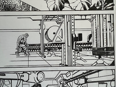
Here's our main character as he makes his way through his weight room...


...and finally he arrives in Reed's lab.


I love brooding Thing. It's part of his character, and it's that emotional resonance that makes the character so compelling. The shadows in this panel really hammer that home. Plus, check out that Kirby Krackle!

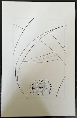
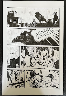
The next page is from the fourth issue, and is a full-page spread, albeit with a lot of empty space surrounding the relatively tiny characters. I absolutely love this one. But wait! If you look closely, you can kind of see more images on the other side of this page...

That's because, unbeknownst to me when I bought it, the Thing page was drawn on the back of another, entirely different page? I sent a message to Reilly to ask about it, and it seems that he simply ran out of blank pages while drawing the Thing series, so he drew the issue 4 spread on the back of a Crow pitch that he had taken to show off at conventions as a sample page. This was an unexpected bonus on an already great piece of art.

I know that it's probably hard to take my recommendation at face value, because I will read (and probably enjoy) just about anything Thing-related. But this series is truly a brilliant piece of superhero storytelling, and you honestly should run out and grab it right away. Everything there is to love about the Thing is in this six-issue series. I can only hope that a sequel is in the works!

Sunday, April 3, 2022

Visiting Dr. Strange's Sanctum Sanctorum - in real life

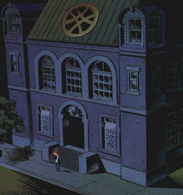
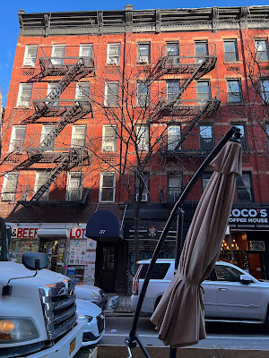
The Sanctum Sanctorum, Dr. Strange's mystical home with the signature rose window at top, is one of Marvel's iconic landmarks in its comic book universe. Like some other Marvel buildings, the Sanctum Sanctorum also has a real-world address in New York City's Greenwich Village. On a recent trip to the city, I decided to seek out this location to see how it stacked up to its comic book equivalent.


Back in 2018, after spending the day at the New York Comic Con, I took to the streets to see if could find the Baxter Building, home of the Fantastic Four, at its 42nd and Madison address. In February of '22, I found myself near the Washington Square Arch, saw a sign that told me I was in Greenwich Village, and decided that it was time to add another stop on the Marvel Universe tour.

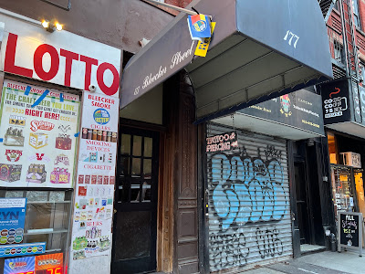
Writer Roy Thomas first gave Dr. Strange's residence its street address, at 177A Bleeker Street - it also just happened to be where Thomas lived for a while. Growing up reading the comics, I had no idea where Greenwich Village was in relation to anything else in NYC, but the name gave it a special significance, I thought, and subconsciously associated it with a gentrified, somehow fancier and more residential section of the city. As it turns out, it's just, like...in a different part of Manhattan.

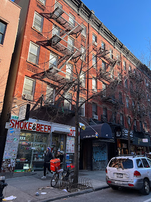
After checking out the Arch, I walked a few blocks and found myself on Bleeker Street. This is a street that Simon and Garfunkel sang about, too, so my expectations were great. I soon found myself at the 100-block of the street, and there, before my very eyes, I found...

...a crappy bodega and some apartments?!

So here it is, the famed home of Dr. Stephen Strange, and also a place where you can get some scratch-off tickets and a nose ring, probably at the same time. There is no longer a 177A designation, either - 177 is as close as you'll get today.

Of course, it's important to remember that Dr. Strange is a sorcerer, and what better way to keep a low profile than to disguise your three-story mansion as a red brick tenement? That must be it - it's all a facade whipped up by Strange, Wong, or any one of the building's other magical tenants. Knowing this, and respecting the magician's code, I declined to investigate further, knowing that it was important to keep up the illusion.

Okay, now that that's over with, let's look at a few other New York attractions, some of which are also featured heavily in the world of comics. Here's the aforementioned Washington Square Arch!


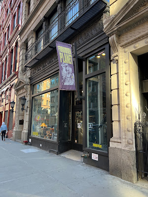
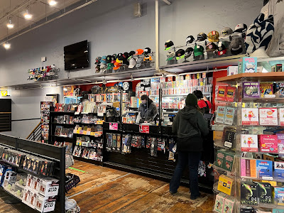
Enough of that. Let's see if we can find a comic book shop nearby. Not too far away was Forbidden Planet, which I believe is the only branch of this UK store located in the United States? Anyway, this was a very cold day in February, and I was happy to walk around inside for a little while.

The store wasn't exactly what I expected - there was a lot of space devoted to toys and maybe not as much to comics as I had hoped to see - but it was still a fun experience. I've really only been to the bigger chain stores in NYC, and I'm looking forward to seeing more of the independent shops on my next trip. Of comic shops, and maybe Avenger's Mansion or something like that.

Sunday, March 27, 2022

Spider-Man visits Pittsburgh in Amazing Spider-Man 292


A while ago, I wrote about a two-issue story in which the Avengers visited Pittsburgh, and of Thor's quick stopover in the Steel City. Both were fun, even if they mostly only featured generic references to the city. When I saw that 1987's Amazing Spider-Man #292 had Pittsburgh as its backdrop, I had to grab it and take some pictures. Let's see what awaits our hero!


Unlike the Avengers and Thor issues, this Spider-Man story is chock full of mostly accurate Pittsburgh references. and we start out with downtown Pittsburgh, the Allegheny River, and Three Rivers Stadium! The stadium would have had to be about ten times its size to look like this from downtown, but I'll allow it. And we also start off strong with references to both the Pirates and the Steelers, longtime tenants of the all-purpose stadium.


Spider-Man then somehow swings past the University of Pittsburgh's Cathedral of Learning, which is miles away and is not surrounded by any buildings he could really swing from, but, well, okay. Spidey is following after Mary Jane Watson, to whom he has recently proposed, but apparently MJ needs time to think it over by talking with her sister, who lives in Pittsburgh. This is the first time I learned that MJ even had a sister! Who is this mysterious sibling who for some reason lives in Pittsburgh? Why didn't she live with their Aunt Anna in New York City? Questions abound.


This issue is basically just one Pittsburgh reference after another. I love 'em, of course, but I wonder why writer David Michelinie and artist Alex Saviuk decided to make this issue one big travelogue. Here we see stately Mellon Square...


...and now we're at Point State Park. Wait, this is basically where Spidey was on page one, across the river from Three Rivers Stadium. Why did he swing to Oakland just to turn around and go all the way back to...you know what? Never mind. I'll just enjoy this for what it is. It looks like Saviuk drew the fountain at Point State Park, but the water got colored green like a tree. I'll admit that I do not know if the fountain was running in '87. I guess there could have been a tree there back then.


What's this? The Gateway Clipper over MJ's shoulder? Why yes, it is!


Peter and Mary Jane discuss her sister's plight as they take a stroll through the park, where MJ mentions the nearby Duquesne University.


Meanwhile, there's some shady business going down at a nearby industrial park. This might actually be the industrial park off of the 31st Street Bridge, which has since been retrofitted into the 31st Street Studios television soundstage.


But the main story takes us back to Duquesne University. I think this is supposed to be the Old Main administrative building?


Both the Avengers story and this one pay special attention to the Liberty Bridge, which is right off of campus, as opposed to the Ft. Pitt Bridge, which I think is more visually appealing. It seems that the Spider-Slayer is also in the 'burgh, which is tough news for Peter. I guess using the Liberty Bridge makes sense when you want to bring in that ultimate Pittsburgh visual reference...

...the Duquesne Incline! I suppose it is pretty iconic. But I think that those not from Pittsburgh might be overthinking how much it's actually used anymore.


At the top of the Incline is, of course, scenic Mt. Washington, which is also name dropped in this issue. They made sure to name pretty much every location in this book.


"We didn't get the opportunity to see the Incline car well enough on the last page. Put it in again."


Wait, "the trolley"?! I take back everything good I've said so far.


So Mary Jane has a sister, and also two young nephews?! And one of them is, I guess, a die-hard Pirates fan, even wearing the '70s-style pillbox hat? Do we ever see these people again?


Our last scene for the book takes place at the Pittsburgh International Airport. Mysteries solved and villains defeated, Peter and MJ head back to New York.


But not before Mary Jane accepts Peter's marriage proposal! Wait, what? What I thought was a throwaway issue is actually one of some spider-historical importance! It's actually the issue that leads directly into Amazing Spider-Man Annual #21 - the wedding issue!


The back cover confirms it! I had no idea.

This whole issue was a pretty wild ride and I'm glad that I picked it up. It managed to squeeze in over a dozen Pittsburgh references in just over 20 pages. I'd love to find and share Pittsburgh in other comics, too, so if anyone has any suggestions, send 'em over!