One skill that I never really thought I'd acquire is creating a font from scratch, but I recently came across the video below from Joshua Smeaton, which shows how he created a font using his own handwriting:
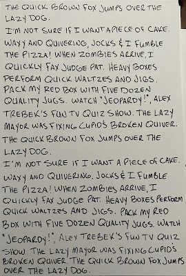
This was enough for me to start working on a font of my own, and pretty soon I was writing out panagrams - sentences that use every letter in the alphabet. Rather than using a digital tablet or an iPad, I hand-wrote all of the letters so they felt more natural. My handwriting is not what I would call artistic or even all that good, so I tried my best to make everything legible while still maintaining my own style. I used comic book backers for this, so now I have a stack of these bizarre ramblings in my house. If anyone would just stumble upon them...well, I guess I have weirder stuff lying around as well.
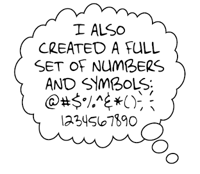
The whole process has been long and involved. I scan the letters into Adobe Illustrator, where the program traces them and makes them individual objects. After choosing what I feel are the best letters, I bring the letters into Fontself, an Illustrator extension, where the work gets even more meticulous. Not only am I looking to create a regular, all-caps font that I can use in comics, but the completist in me has put in motion a lowercase version, too, complete with alternate symbols for almost every character. In addition to this, there are bold, italic, and bold-italic versions that many good fonts need, plus symbols and other letters that are more common in Spanish and European countries that I'm trying to incorporate as well.
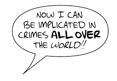
In all, this has been a ton of work, but the results are, so far, fun and at least somewhat encouraging. The above balloon looks okay, I think, though I'm continuing to tweak things that I think could be better. I figure that I'll be at this particular task for another month or two before I finally put it to rest. But at the end, I'll have a font that is completely my own and not subject to any licenses or agreements, and hopefully one that I find some uses for, too.
I've named this particular creation the McClellafont, which is a bit self-centered of me, of course, but it's mine and I'm owning it. I considered different variations of spelling like "McClellaphont," "McClell-O-font," "McClellephant," and other, worse options, but "McClellafont" is what we're going with for now.
While I'm waiting for the paint to dry on the McClellafont, I went ahead and made a much simpler font using a similar method, based on the keystrokes of my much-ballyhooed 1930s Underwood typewriter.
For this one, I typed up a bunch of text, scanned the letters, *painstakingly* adapted them in Photoshop, and then brought them into Illustrator, where Fontself took care of the spacing and kerning. Manual typewriters have fewer keys than a modern keyboard (mine does not have a key for the number 1; you use a capital I as a substitute), so this one had fewer characters to use.
This font, which I am unimaginatively calling "Underwood 1930s," features a regular and italic version with numbers and all of the symbols that are included on the actual typewriter. The one exception is the exclamation point. If you wanted to exclaim something using this machine, you needed to type a period and then draw in the top line with a pencil or pen. I felt that I couldn't be without one (I get excited sometimes), so I created one using two existing symbols, and the result is what you see above. I made a few tweaks before I was happy with the final version, as seen below:
I can hear the clickety-clack of the keys and the thunk-thunk of the carriage as I read the words! I'm not sure how often I'll use these fonts, but it was interesting to make them and I'm happy I did it. I have plans for maybe one or two more before my font-creating career comes to a close. But maybe you'll see one or both fonts in a published comic book before too long.


